
The template opens in a separate editor with Edit and Preview modes. Edit its name, subject, language and email body. Changes save automatically.
Open a template
- Open Templates under Network.
- Select a template row.
It opens as a separate page at every screen width. Every member can read and preview it on Band Silver or higher, or Artist Gold. Contributor or higher can edit. Without edit access, fields and insertion buttons are locked and the formatting menus and design inspector are absent.
Note
Existing templates remain readable through a saved link after a downgrade. Creating, copying, deleting and editing them still requires the subscription feature and Contributor or higher.
Header
| Area | What it shows or does |
|---|---|
| Template name | The current name is the heading. |
| Back | Saves pending changes and returns to Templates. |
| Delete | Removes the template and returns to Templates. Contributor or higher. |
Template fields
| Field | What to enter | Notes |
|---|---|---|
| Name | A name for this template. | Required, unique within the workspace regardless of case, up to 200 characters. |
| Subject | The email subject. | May contain inline merge fields from this template’s catalogue. Copy the exact field spelling between double braces. |
| Language | English or Dutch. | Changes formatting of merged values and reloads the field samples. Your own text stays as written. |
The template type is fixed. To use the other type, create another template.
Edit
Type in the email canvas. Select text for its floating formatting menu. Type a slash to open the insertion menu. Select an image or button for its alignment and link menu. The library controls are in English in both app languages; the alignment buttons use your app language.
| Control | What it does |
|---|---|
| Text, Title, Subtitle, Heading | Inserts or selects a paragraph or one of three heading levels. |
| Bullet list, Numbered list, Quote | Inserts a list or quotation block. |
| Button | Inserts a linked button. Select it to set its link and alignment. |
| Divider, Section | Inserts a divider or section in the email layout. |
| 2 columns, 3 columns, 4 columns | Inserts a layout with that number of columns. |
| Text formatting icons | Toggle bold, italic, underline, strikethrough and uppercase on the selection. Link controls add, open, edit or remove a text link. |
| Align left, Align center, Align right | Aligns the selected image or button. Its link controls can attach or remove a link. |
Note
Direct image uploads are not supported in this editor. Use Images in the catalogue.
Merge fields
- Place the cursor where the value belongs.
- Select a field button, or drag it from Merge fields to the insertion point.
- A normal field inserts a value in a sentence. A button prefixed with # inserts a formatted block on its own line.
The catalogue shows the field spellings below as its button labels. These are the names you can select in the editor. Use only fields belonging to the template’s type.
| Catalogue label | Value | Template type |
|---|---|---|
| band.name | Profile name. | Both types |
| band.short_bio | Short bio. | Both types |
| band.bio | Bio. | Both types |
| band.city | Profile city. | Both types |
| band.formal_name | Formal name. | Both types |
| band.kvk | Registration number. | Both types |
| band.spotify_handle | Spotify | Both types |
| band.youtube_handle | YouTube | Both types |
| band.tiktok_handle | TikTok | Both types |
| band.instagram_handle | Both types | |
| band.facebook_handle | Both types | |
| band.bandsintown_artist_id | Bandsintown | Both types |
| #band.address | Formatted profile address block. | Both types |
| venue.name | Venue name. | Venue outreach |
| venue.city | City. | Venue outreach |
| venue.country | Country. | Venue outreach |
| venue.category | Category. | Venue outreach |
| venue.organization_name | Organization name. | Venue outreach |
| venue.kvk_number | Registration number. | Venue outreach |
| venue.tax_id | VAT ID. | Venue outreach |
| #venue.address | Formatted venue address. | Venue outreach |
| contact.name | Contact name. | Venue outreach |
| contact.first_name | First name; falls back to “there” in English or “daar” in Dutch if missing. | Venue outreach |
| invoice.number | Invoice number. | Invoice email |
| invoice.issue_date | Invoice date. | Invoice email |
| invoice.due_date | Due date; optional. | Invoice email |
| invoice.total | Total including VAT. | Invoice email |
| invoice.total_excl_vat | Total excluding VAT. | Invoice email |
| invoice.vat_amount | VAT amount. | Invoice email |
| invoice.payment_url | Payment link; optional. | Invoice email |
| invoice.event_date | Gig date; optional. | Invoice email |
| invoice.event_description | Gig description; optional. | Invoice email |
| #invoice.payment_block | Formatted payment details; optional. | Invoice email |
| customer.name | Customer name. | Invoice email |
| customer.email | Customer email; optional. | Invoice email |
| customer.contact_title | Salutation; optional. | Invoice email |
| customer.contact_given_name | Given name; optional. | Invoice email |
| customer.contact_family_name | Family name; optional. | Invoice email |
| #message | The message added when sending an invoice; optional. | Invoice email |
For an inline subject value, for example, type {{band.name}}. Insert address and payment blocks through the catalogue in the body. Missing required values cause a venue recipient to be skipped during campaign review. Optional invoice fields can be empty.
Images
Select an image tile to insert it at the cursor, or drag it into the canvas. Available profile images and social links come from Profile. Unconfigured tiles are disabled and show Configure in Profile.
| Section | Choices |
|---|---|
| Branding | Band banner, Light-theme logo, Dark-theme logo, Band avatar, Dark clap icon, Light clap icon, Dark gigBuddy logo, Light gigBuddy logo. |
| Social icons | Facebook, Instagram, TikTok, YouTube, Spotify, Bandsintown. |
| Icon color | Black (initial choice) or White. Affects newly inserted social icons. |
Social icons include a link to that service. Inserted images start centered with their catalogue size and alternate text. Use the image menu or design inspector to change their alignment, link, size or alternate text. See Profile.
Design properties
The inspector follows the current selection. Its breadcrumb shows the selected element and its parents; select a parent to edit its layout. With no specific node selected, document controls apply to the whole email.
| Panel | What you change |
|---|---|
| Background | Background color of the document or selected element. |
| Container | Document container color, width, padding and corner rounding. |
| Attributes | The selected element’s available attributes, such as an image’s Source, Width, Height, Alt and Link, or a heading’s Level. |
| Border | Border controls for elements that support them. |
| Column spacing | Spacing between columns. |
| Spacing | Margin and padding. |
| Size | Supported element dimensions. |
| Typography | Font, size, color and text formatting. |
| Link | The selected text’s link. |
The available panels depend on the selected element. These library labels stay in English.
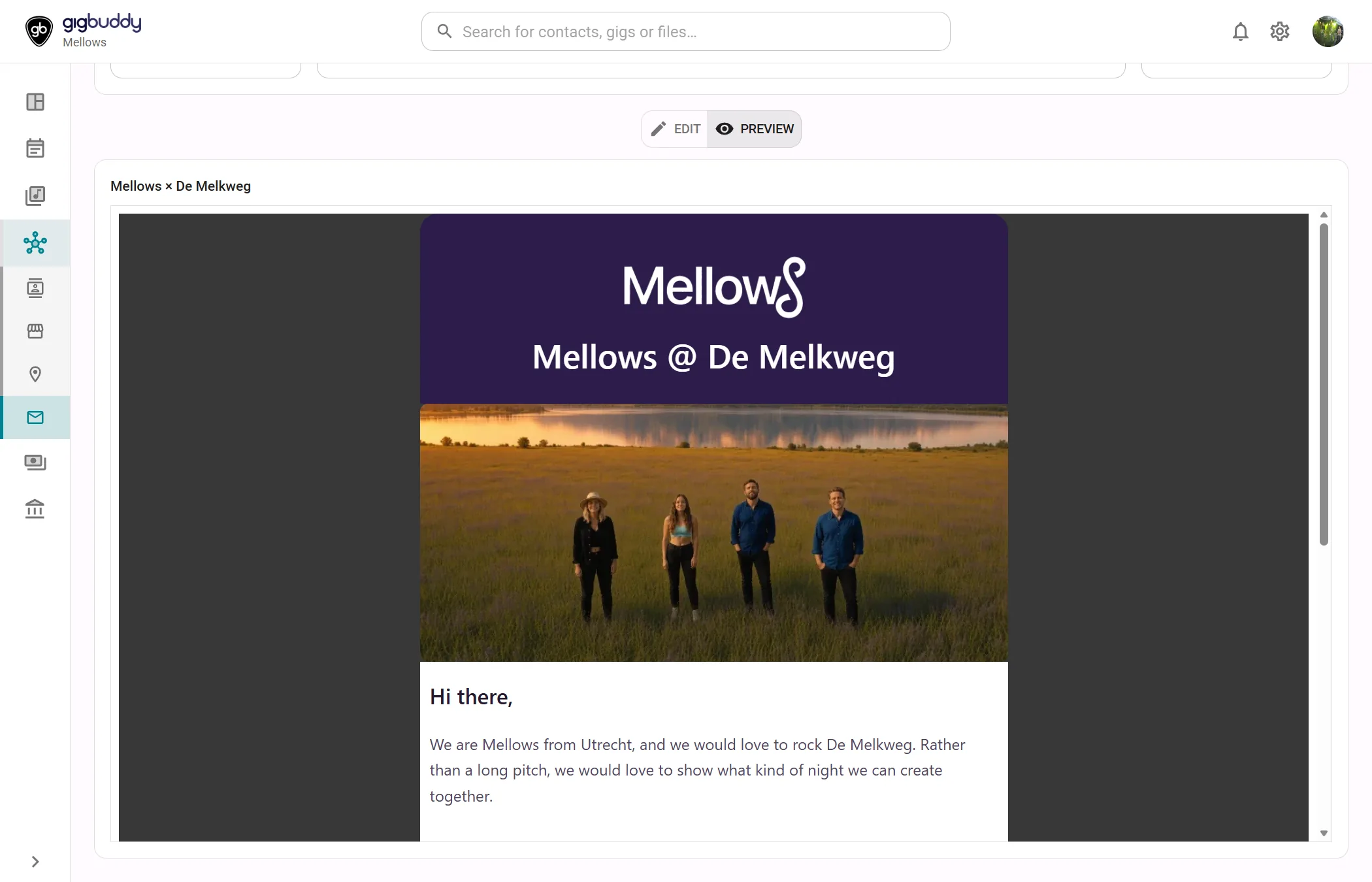
Preview
Shows the rendered email and resolved subject without sending anything. Profile fields use the workspace’s saved data; venue, contact, customer and invoice fields use samples or placeholders. The preview does not show a specific campaign recipient. Switch back to Edit to change the body.
Actions
| Action | Where | What it does |
|---|---|---|
| Edit | Mode switch | Returns to the editor. |
| Preview | Mode switch | Renders a sample email. |
| Back | Header | Saves changes and returns to the list. |
| Delete | Header | Removes the template. |